If you find this post useful, please Restack so it can help others.
I love writing for Substack, but I find the User Interface to be very confusing. As a professional User Experience Designer with 20+ years of industry experience, I find this exasperating. I know that this would all be relatively easy to fix from a technical perspective, but I do not get the impression that Substack is trying to do so. As is typical in the software industry, rolling out new features is deemed more important than improving usability.
As far as I know, there is no overview documentation of the Substack User Interface. I have tried contacting Substack executives and managers about giving them free advice, but they so far have ignored me. I decided to write my own “user manual” and publish it to my readers. I hope that it helps.
As far as I can tell, the biggest problem is that:
There are effectively 5 different Home pages, each with different functionality.
Each is poorly labeled in the User Interface.
Navigating between them is frustratingly difficult.
It is difficult to know which home page is the means to reach your desired functionality.
Because of all the above, I find that trying to perform a new task in Substack is like an Easter Egg hunt. And the Customer Support AI has lots of incorrect information.
I admit that this is a complex UI Design problem to solve because there are:
Readers’ views and writers’ views, which need different functionality
Accounts vs Substack columns (a writer can have multiple columns, which is a nice feature.
Browser vs Substack app (which is apparently not available for Mac computers, which is what I use)
Note: I believe that Substack has branded their individual columns to be “Substacks.” The term “Substack” has many different meanings in the UI, and this becomes confusing during navigation. It also makes Customer Support AI very difficult to follow.
Overview of UIs
Here is what I have learned about the home pages. Unfortunately, various Substack functionality is spread across these home pages, and it is not easy to figure out where it is. The Substack Customer Support AI is often wrong about navigation, so it does not help much in this domain:
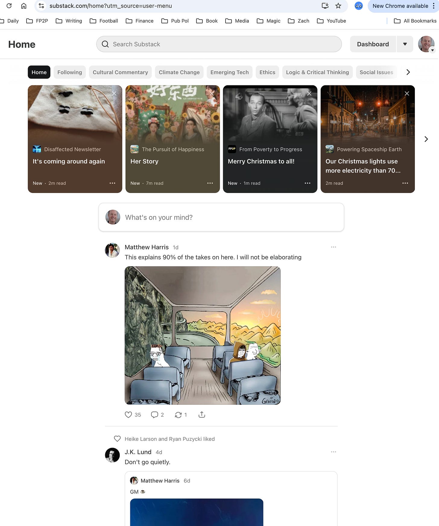
Home page in the browser (this is your feed, so you see Notes from people that you have followed and subscribed to.
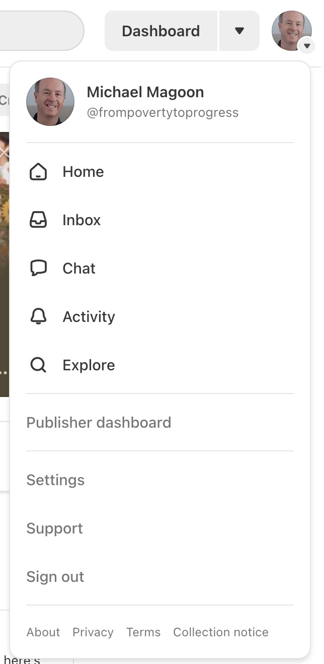
You navigate to the Home page, by clicking your Profile photo on the top right and then choosing “Home.” (see graphic below).
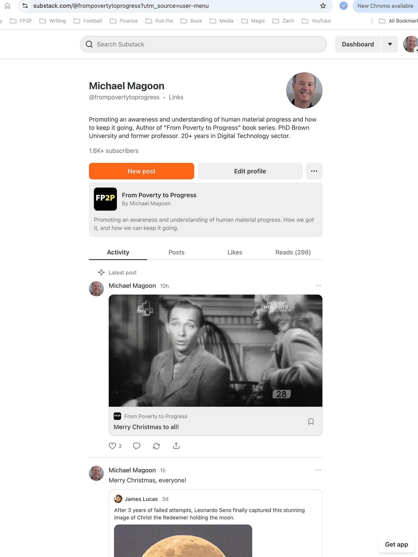
Profile page in the browser (this is what Substack users view in the browser).
You navigate to the Profile page, by clicking your Profile photo on the top right and then choosing the first item in the menu with your name (see graphic below).
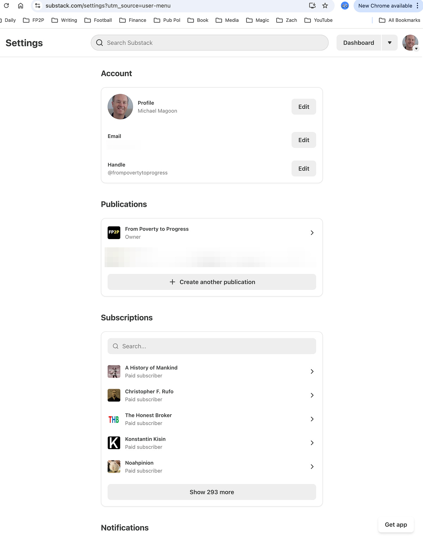
Account page in the browser (this is how writers control their Account settings). As far as I know, readers do not have access to this unless they have set up their own Substack account.
You navigate to the Account page, by clicking your Profile photo on the top right and then choosing “Settings.” (see graphic below).
Note that this is a very confusing name as Substack has many Settings pages. I have put in a feature request to relabel this control, but so far nothing has happened.
Dashboard page in the browser (this is how writers control their individual Substack column and the bulk of their functionality; writers can have multiple columns).
You navigate to the Account page, by either:
Clicking “Dashboard” to the left of your Profile photo.
Clicking your Profile photo on the top right and then choosing “Dashboard.”
There are also various “Home” pages on the Substack app. Since I use the app infrequently, I will not explain them. I don’t want to cause even more confusion.
Navigating to the various “Home” pages
Navigating within the browser version of Substack is largely via the navigation menu on the top right. Sorry for the huge graphic size.
Screen captures of the various “Home” pages.
Here are screen capture of the various “Home” pages. Note that since I am a writer, I like to have much more functionality than typical readers.
Sorry for the huge size, but Substack does not give me an easy method to shrink the image (the “scale” functionality does not appear to work correctly).
Home page
I believe that this is the equivalent of a social media feed, so the content will be different for each person. The Home page displays a list of Notes published by writers that you have followed or subscribed to.
Profile page
I believe that this looks the same for Readers and Writers, but I may be incorrect.
Account page
I believe that both Readers and Writers have this page. Its main utility is to manage:
Your profile
Your subscriptions to other writers
Your notifications
Accounts that you have muted or blocked
Account security
Dashboard (home tab)
For writers, this is by far the most useful functionality. Note that there are a huge number of features divided up between the tabs at the top.
I believe that Readers do not have this functionality, but I may be incorrect.
A simple solution
UI redesigns for widely used software are among the most likely to receive significant user backlash. Even if the UI is objectively “better,” most users do not want to be forced to learn a new UI. Therefore, I suggest the following minimal changes:
In both the navigational menu and the page title at the top left of each page, use a consistent naming scheme.:
Profile (instead of just showing a photo and name)
Your Note’s Feed or Notes (instead of Home)
Dashboard (keep that the same)
Also consider displaying the name of each column instead of a generic name when there are multiple columns for eachAccount Settings, instead of just “Settings”, which is non-unique.
Make sure that this terminology is consistent in the following:
Navigation menu on the top left
Page title on top left (so user know what they are looking at)
Substack documentation (and make sure that an overview of the UI navigation is profiled in both the Readers and Writers section of Help Center.
Customer Support AI
A plea to Substack executives
I have attempted to communicate to Substack executives to tell them that I am willing to give free UX advice that goes far beyond what is listed above. So far, I have gotten no reply.
I hope that that a Substack employee will contact me in response to this article.
.


Thank you! I thought it was just my old ass brain that couldn’t make it make sense.
Substack’s navigation is the main reason I spend so little time here, even though I subscribe to a few creators here. Thank you for posting this.